ShopDreamUp AI ArtDreamUp

Deviation Actions


Description
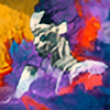
Requiem for the Beast. 08
Mixed media, Masonite/Canvas/Papers & Board.
Oils, Acrylics, Inks, Watercolours, Bitumen, Impasto.
RFTB is a six panel piece I completed over the span of two and a half months. Mostly at school painting at lunchtimes.
The work is accompanied by two books:
Evolution of the Beast
Subconscious Thoughts of the Beast
--
Practice
--
The size of the work is rather large; each panel is a metre in height and each panel from the left is progressively wider. Starting from 13 and ending on 16 (apart from the larger centre panel). Each panel is of a different material too, from the left it goes wood(which I used for the grainy texture), watercolour paper (with a very high cotton %), masonite (which allowed for smooth use of the bitumen), canvas (So I could create a feathery or impressionistic texture over a very deep yellow), this was followed by a large piece of masonite which I covered in all sorts of… sorts. And finally the final piece is a larger piece of material I use for most of my paintings (Such as the Philosophers Ego) which I applied the same method of layering and material use as I do on my usual works.
I was being very ambitious with this piece and I’m sure allot of viewers will think I fell a bit too short and some fill think I flew over through the ring of fire, but the point of this painting for me was to work with as large a size I could and with as many materials I could while harmonizing all of the colours and materials. Again, I’m aware some people will see this is a failed attempt and others will see it as a success and I’d like it if you would tell me which you think which category falls into.
 (Smile)")
--
Intentions
--
Mixed media, Masonite/Canvas/Papers & Board.
Oils, Acrylics, Inks, Watercolours, Bitumen, Impasto.
RFTB is a six panel piece I completed over the span of two and a half months. Mostly at school painting at lunchtimes.
The work is accompanied by two books:
Evolution of the Beast
Subconscious Thoughts of the Beast
--
Practice
--
The size of the work is rather large; each panel is a metre in height and each panel from the left is progressively wider. Starting from 13 and ending on 16 (apart from the larger centre panel). Each panel is of a different material too, from the left it goes wood(which I used for the grainy texture), watercolour paper (with a very high cotton %), masonite (which allowed for smooth use of the bitumen), canvas (So I could create a feathery or impressionistic texture over a very deep yellow), this was followed by a large piece of masonite which I covered in all sorts of… sorts. And finally the final piece is a larger piece of material I use for most of my paintings (Such as the Philosophers Ego) which I applied the same method of layering and material use as I do on my usual works.
I was being very ambitious with this piece and I’m sure allot of viewers will think I fell a bit too short and some fill think I flew over through the ring of fire, but the point of this painting for me was to work with as large a size I could and with as many materials I could while harmonizing all of the colours and materials. Again, I’m aware some people will see this is a failed attempt and others will see it as a success and I’d like it if you would tell me which you think which category falls into.
--
Intentions
--
For those who like to explore my painting on their own and find their own patterns, you might not want to read on as I’m about to explain a few of them.

There are many design motifs included in this painting, usually I can fit two of three into a small work so I guess I went a bit overboard on this piece but it was fun and that was apart of the challenge I set for myself.

The first one I would point out to anyone would be the circle in the top left of the piece and the egg in the bottom right of the piece. I made both of these shapes by using a drum cymbal and tracing it, but for the egg I halved the circle and shifted them in opposite directions to create an oval. The circle to the left represents the figures brain, which is divided into halves, one for the creative chaos and the other for its power, control and lack of both.  I’ll also point my finger to the the shape in the creature other hand and the relationship between them

The egg represents all the things one would normally associate with and egg and I placed two extra circles which again represent control and chaos. The Importance of the egg though is its placement within the composition. If you could see it up close it is probably the prettiest part of the painting. The placement of the egg scales and balances out the rest of the painting and this leads me onto my next motif.
If you will now, look closely at the round eye ball that stares directly at you, you will notice that it looks rather… Large. If you then notice that large blue area you will see that that eye ball becomes the eyeball to an entirely different creature, with great big lion like hair and purple horns. I’ve never been able to really show this to people until now because when it’s right in front of you, there are too many other things to take in. So unless you see it from a distance it is rather hard to see the big blue creature that is storming across the page.
The other more obvious figure was required to be drawn as formless as possible to allow for this to happen, so I only included his face, as a mask, and his right arm and left hand.


And finally the last thing I will make a point of is the way I harmonized the different elements and materials. Because each base was of a different material it meant I had to apply the mediums on different layers and steps. This forced me to have to think very far in advance of where certain colours or elements would go where. For example, bars of colours you see on the third panel from the left were the first thing I did, while the bars on all the others panels were the last things I did. The bitumen (the black oiling chaos on panels one and two from the left) were applied first and last. And the eye was the very last thing I did to the painting. Everything was timed and layered specifically while the whole time I was working on the piece I had people breathing down my neck about time and work and how much little time I spent painting it.

But it’s finished now. It’s in my house, getting dusty, old and a bit damaged. It’s a personal reminder of what 2008 was like for me in terms of school, friends, family, art and even music.

It’s finished…  Thank you for reading - Lyndsay
Image size
2000x1006px 3.24 MB
© 2009 - 2024 LyndsayHarper
Comments43
Join the community to add your comment. Already a deviant? Log In
wowa-weewa 

Me--->
Me--->